The team at CG Design Studio have put together their go-to colours and we are in love!
As we are spending more time than ever in our homes at present, there is ample time to reflect on ones surroundings. The recent queues at hardware stores are evidence of our current desire to use this time at home wisely, by undertaking DIY projects to update our spaces. While some may be making online purchases of new furniture or décor, one of the simplest ways to make a big difference to your interior is a fresh coat of paint.
We have put together a list of our ‘go-to’ colours for a fail-safe colour guide for your DIY home update. From soft neutrals to bold hues, these dreamy tones are favourites of the CG team.

White: Whitsunday Island, Dulux
It’s not uncommon to be overwhelmed with the infinite whites available, with the risk of being too warm, too cool, or throwing an unwanted undertone. We find that Whitsunday Island is the perfect clean and crisp white, which adapts to all surroundings and compliments all palettes, materials and finishes.


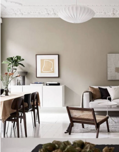
Grey: Brume, Dulux
If you are drawn to fresh whites, but are dreaming of a change, Brume could be for you. This colour can truly transform a space, particularly stunning in bedrooms or living areas, giving the space softness in a contemporary manner. Often greys can throw a pink, violet or blue undertone, which isn’t the case for Brume, resulting in our current love-affair with this colour.


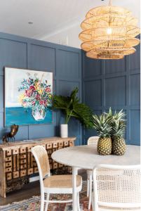
Duck Egg: Newport Blue,Porter’s Paints
A timeless duck egg meets grey hue that is perfectly suited to classic or Hamptons style homes. Newport Blue is calming and sophisticated, and an excellent way to add a hint colour and elegance, particularly stunning when paired with crisp white trims. If you want to dial it up further, opt for Double Strength Newport Blue.


Blue: Buoyant Blue, Dulux
We love Buoyant Blue, particularly when featured as an accent colour. It’s bold yet calming and compliments a myriad of colours. Striking against white and soothing when combined with Timber.

Green: Spanish Olive, Dulux
Green can be daunting, despite being a tone that we are constantly surrounded by in the natural environment. Spanish Olive is a stunning, earthy green that is soft and subtle enough to commit to as an exterior or interior colour.

Warm Neutral: Beige Imp, Dulux
If white isn’t your thing and you are wanting to warm up your interior, Beige Imp is a soft, soothing neutral tone that is equally earthy and fresh. With a stone-like undertone, this colour is versatile enough for interior and exterior en-masse application, well-suited to both classic and modern homes.


Charcoal: Black Caviar, Dulux
While we tend to use charcoal more frequently externally or as window joinery, this bold tone can add contrast and drama when utilised internally. We find Black Caviar extremely versatile, as it possesses a sense of softness and flexibility that can lend itself to both warm and cool spaces, as well as classic and ultra-contemporary design.

Trim Tip: Go White!
Trim Tip – we like to use a fresh, crisp white for our architraves, skirtings, doors and trims, such as Lexicon, or Half Lexicon (Dulux).


